If you’re interested in studying immunology or subpopulations of cells, you’ll soon find yourself encountering flow data in the literature. Data reported from flow cytometry experiments can be a little challenging to understand if you’ve never done any flow. But in order to plan a flow experiment, you’ll need to first read papers with flow data... and to read them it's helpful to have done flow first… which can send you in an endless loop. Let’s break out of the loop with all you need to know on how to read a flow plot.
Dot plots
Flow cytometry is a method that allows users to analyze single cells in a population. It can be used to measure protein expression, identify rare cells, or even sort out single cells through FACS. This work is done in flow cytometers, and output is generated through measurement of events. An event is something that passes through the machine’s lasers and gives off a signal read by the machine’s sensors. (Usually this something is a cell, but it could be debris or unbound antibodies.) Each event read by the machine is plotted as a dot on an X,Y axis to generate a dot plot (Figure 1). Clustered events are called a population.
 -min.png?width=293&height=279&name=FACS%20(1)-min.png)
|
| Figure 1: While the plot generated often looks like the graph on the left, it might make more sense once you realize events are plotted on an invisible Cartesian plane (right.) Each event is plotted by the amount of signal read from Marker A and Marker B. Created with biorender.com. |
The goal of flow cytometry is to use increasingly more stringent markers to identify your specific cell population of interest. The markers you use, and the order you use them in, is known as your gating strategy.

Gating Strategies
The series of markers you use to define your population is called your “gating strategy.” This series of markers are set up sequentially, from broadest to most specific marker, and are represented as a series of dot plots in the same order. However, in an actual flow cytometry run, all markers are read in parallel.
Let’s imagine we’re looking for cells in a sample that are negative for marker A and positive for marker B, or A-B+ cells. If you look at the dot plot in Figure 2, you might assume that all cell populations are positive for both markers, because we usually assume (0,0) to be at the intersection of X,Y. For flow plots, however, that is generally not true. Because of the variations in fluorescent signals, and how the machine reads/interprets the signals, the axis is instead divided into positive and negative signal at a point on the axis determined by the researcher, based on their controls. You can usually tell where this point is by looking at the different populations. In the case of Figure 2, one population is B- and another two are B+. Our A-B+ cells are in the lower right corner.
-min.png?width=487&height=341&name=FACS%20(4)-min.png)
|
| Figure 2: This flow plot has two populations that are B+ and one population that is B-. Created with biorender.com. |
If it’s hard to conceptualize where the populations are, try drawing a quadrant over the plot that divides it into four, using the location of the cell populations as a guide (Figure 3.) You can see that in our dot plot, we have A-B- cells, A-B+ cells, and A+B+ cells, but no cells that are A+B-.
|
|
| Figure 3: It's often easier to identify different populations by imagining (or drawing) a quadrant over the dot plot. Created with biorender.com. |
-min.png?width=330&height=318&name=FACS%20(5)-min.png)
Of course, this is quite easy to do on a plot generated in Biorender! While a helpful visualization tool, a quadrant will often be too clean for real-world data. Most plots will have a shape, like a box, ellipse, or circle, drawn around clusters to define populations. This shape is called a ‘gate’; it tells the machine that everything inside the gate is one population and everything outside the gate is a different population.
Gating and plot orders
As the gates progress from broadest markers to most specific, the first step is to separate cells from debris and roughly group the cells by size. This is done using side scatter (SSC) and forward scatter (FSC), which measure light that “scatters” past the cell, instead of fluorescent markers. There are various types of SSC and FSC that can be used for this purpose.
 Pro tip! The forward scatter is a proxy for diameter and volume of the cell, thus allowing the exclusion of doublets and debris. The side scatter roughly measures granularity, a proxy for nucleic complexity of the cell.
The sample will have been labeled using a panel of markers, which is comprised of antibodies conjugated to fluorescent markers and/or cellular dyes and stains. These will be used in a series of one- or two-marker plots, like in Figure 3 above, until the population of interest has been successfully identified and isolated.
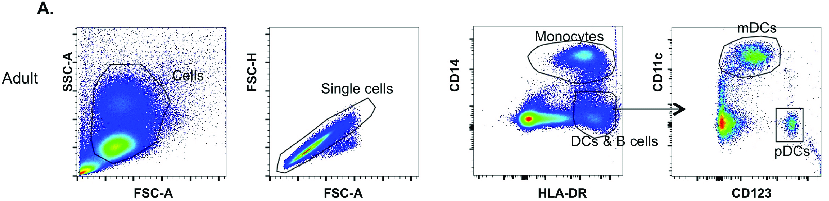
Following a gating strategy
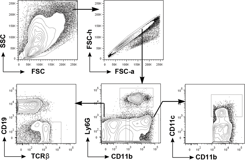
Figure 4 shows a gating strategy from a published experiment (Barlow-Anacker et al., 2017). This gating strategy is used to identify two types of dendritic cells (DCs), mDCs and pDCs. Let's follow it from left to right.
First, SSC and FSC are measured to differentiate cells from debris. Cells are gated, and in the gated population, two types of FSC are used to separate single cells from doublets, ignoring anything not within the gate of the first plot. Notice that the doublets and single cell populations are very close to each other.
|
| Figure 4: Gating strategy used in Barlow-Anacker et al., 2017 to identify mDCs and pDCs. Used under Creative Commons license. |
In the third plot, anti-CD14 and anti-HLA-DR antibodies conjugated to fluorescent markers are used to identify monocytes (upper right) and a mixed population of B cells and dendritic cells (DCs) in the lower middle right. DCs and B cells are HLA-DR+ and CD14-.
In the final plot, the mixed population of B cells and dendritic cells is further separated into three different populations using conjugated antibodies against CD11c and CD123. You can see that mDCs are CD11c+ CD123- and pDCs are CD123+ CD11c-. Finally, B cells are CD11c- and CD123-, forming a population in the lower left(ish) corner.
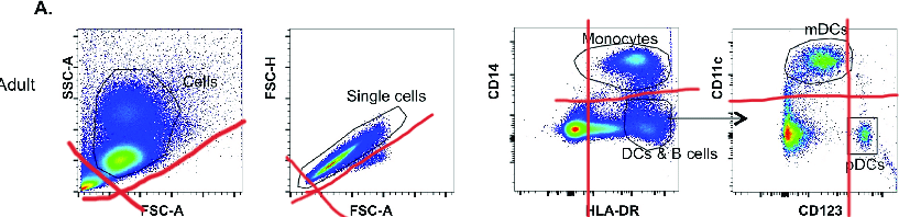
If it’s a bit difficult to see these populations, I suggest using the imaginary quadrant to help (Figure 5). Even though this real-world data is far messier than biorender plots, quadrants can still help me as a reader if I'm struggling to see the different populations on a plot.
|
| Figure 5: The gating strategy from Barlow-Anacker et al., 2017, with quadrants to help visualize the different populations. Used under Creative Commons license. |
![]() Pro tip! Subtypes of immune cells are often defined by a subset of the markers used to identify them, such as “CD123+CD11c- pDCs.” Some cells are defined not by the presence or absence of a marker, but by the amount of marker that is present, which would be annotated like so: CD14high or CD14low.
Pro tip! Subtypes of immune cells are often defined by a subset of the markers used to identify them, such as “CD123+CD11c- pDCs.” Some cells are defined not by the presence or absence of a marker, but by the amount of marker that is present, which would be annotated like so: CD14high or CD14low.
Don’t be intimated if you’re struggling to understand how the researchers decided to place their gates on the plots! Flow data is messy, so learning how to gate takes a lot longer than learning how to read a gating strategy.

Other information
FACS plots often contain other data. Some will have numbers by gated populations; this indicates the percentage of total events contained in the gated population. Heat maps are often used to indicate the relative density of cells. You can see both of these features in the gating strategy shown in Figure 6.
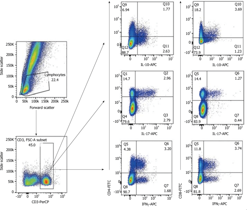 |
| Figure 6: This flow data, from Boix et al., 2018, uses quadrants to gate and has numbers representing the percentage of cells in each gate. Used under Creative Commons license. |
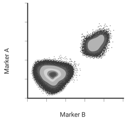
Contour plots
FACS data can also be presented as contour plots. Contour lines, which you may have seen on elevation maps, are used to show frequency of events, instead of relying on clustered dots. In a contour plot, each line contains the same number of events. Thus, contour lines that are close together show a high density of cells, while contour lines that are spread apart show a low density of cells (Figure 7).
 |
| Figure 7: Contour lines in flow data from Jhunjhunwala et al., 2015. Used under Creative Commons license. |
Histograms
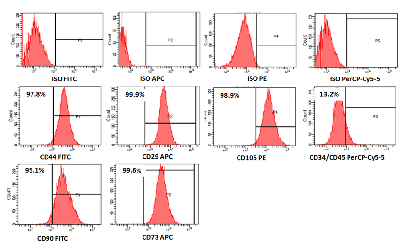
For analysis of a single marker, a histogram showing frequency of events on the Y axis and strength of signal read on the X axis may be presented. A horizontal line across the peak will indicate the cut-off value for a positive signal (Figure 8). Note that the signal is actually on the X axis; what the horizontal line does is define a point where the peak is sufficiently narrow to count as a “true” signal.
 |
| Figure 8: A series of histograms from Alyamani et al., 2018, showing number of events within a single signal in a flow experiment. Used under Creative Commons license. |
Of course, there are many more things to learn about when diving into flow cytometry data. There’s different ways to use FSC and SSC, as briefly alluded to above. There’s many variations in how one can gate, select, and analyze data. But now that you can read a FACS plot and follow a gating strategy, you can start to ask why the researchers made the decisions they did in their experiments and determine if a similar approach would be good for your work. Hopefully this blog helps you with that…and happy flowing!
References and resources
References
Alyamani, A., Kalamegam, G., Ahmed, F., Abbas, M., Sait, K., Anfinan, N., Al-Wasiyah, mohammad khalid, Huwait, E., Gari, M., & Al-Qahtani, M. (2018). Evaluation of in vitro chondrocytic differentiation: A stem cell research initiative at the King Abdulaziz University, Kingdom of Saudi Arabia. Bioinformation, 14, 53–59. https://doi.org/10.6026/97320630014053
Barlow-Anacker, A., Bochkov, Y., Gern, J., & Seroogy, C. (2017). Neonatal immune response to rhinovirus A16 has diminished dendritic cell function and increased B cell activation. PLOS ONE, 12, e0180664. https://doi.org/10.1371/journal.pone.0180664
Boix, F., Llorente, S., Eguía, J., Gonzalez-Martinez, G., Alfaro, R., Galián Megías, J. A., Campillo, J., Moya-Quiles, M., Minguela Puras, A., Pons, J. A., & Muro, M. (2018). In vitro intracellular IFNγ, IL-17 and IL-10 producing T cells correlates with the occurrence of post-transplant opportunistic infection in liver and kidney recipients. World Journal of Transplantation, 8, 23–37. https://doi.org/10.5500/wjt.v8.i1.23
Jhunjhunwala, S., Aresta-Dasilva, S., Tang, K., Alvarez, D., Webber, M., Tang, B., Lavin, D., Veiseh, O., Doloff, J., Bose, S., Vegas, A., Ma, M., Sahay, G., Chiu, A., Bader, A., Langan, E., Siebert, S., Li, J., Greiner, D., & Anderson, D. (2015). Neutrophil Responses to Sterile Implant Materials. PloS One, 10, e0137550. https://doi.org/10.1371/journal.pone.0137550
More resources on the Addgene blog
Conventional vs. Flow Cytometry
Plasmid-based Recombinant Monoclonal Antibodies
Topics: Antibodies, antibodies 101


Leave a Comment