You’ve done great research and made interesting discoveries. You’ve analyzed the data and generated beautiful figures. And, you can’t wait to tell your story. But, before you can show off your work at a conference, you need to first make your poster. While a poster generally contains the same sections as a primary research article, it’s important to understand that presenting your work in poster format differs in many ways from writing a manuscript.
If you have ever attended a scientific conference, or even a lab recruiting session at your university, you are likely aware of how different posters can be. You have also probably thought about why certain posters resonate with you (or not). It is important to reflect on these impressions when thinking about crafting your own poster.
What sets a scientific poster apart?
First, a good poster should catch the audience’s eye and draw people in. That can be accomplished with an exciting title and attractive figures. Next, the poster should be legible from a distance. This means big font and fewer words. Further, the poster should be easily navigable and efficient; your questions, data, and conclusions should be clearly identified and interpreted in less than a couple of minutes.
How does one accomplish all of that? What follows are some tips to help you build a great poster.

Tips for designing your poster
Check conference guidelines
To begin, you should always follow conference rules when designing your poster, since they can differ. 48” x 36” tends to be the most common poster size, but this can vary as well.
Sections of your poster
In almost all scientific posters you will find a title, author names and affiliations, introduction, methods, results, conclusions, and acknowledgements sections. Some other additions you might wish to include are a references section, contact information, and potentially a photograph of yourself. A photo can be very useful in the event that you will not be physically present at your poster at all times, so other participants can identify you. You may also wish to make creative use of a footer in your poster. This is a section where you can insert your references and contact information, and it is generally acceptable for the font here to be much smaller than in other poster sections, so you can include a lot more.
Font size: Making your poster readable
While we are talking about font, remember this: bigger is better! Your poster should be readable from several feet away. It can also be useful to use two different font styles; one for your section titles, and a different one for the body of those sections. This strategy helps your sections stand out, and makes the entire poster more navigable.
Choose your content wisely
Remember that less is more! Posters should not look like a primary research article condensed into one big page. Your sections should be as concise as possible, communicating only the most important results to your audience. With a poster, you have the advantage of being able to verbally communicate your work, so you don’t need every little detail on the board.
Poster layout
While it’s good to let your ingenuity shine, and you generally have free reign over how you put your poster together, be aware that there are some particular styles recognized to work well. It is important that your readers can navigate your poster and follow the logical progression of your work, and you can accomplish this by employing a neat and organized format.
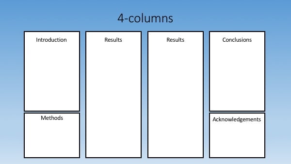
- Columns. You can choose from either a two, three, or four column style, and in all cases the idea is the same; the reader will navigate the poster from column to column left-to-right, which is the natural way that people expect to read. The key to the success of this style is clear borders around your columns, and good spacing between them so that they are easily distinguished. The UCLA Library offers some Powerpoint based templates with different column numbers for a good starting point. Adobe also offers free poster templates, although most are vertical.
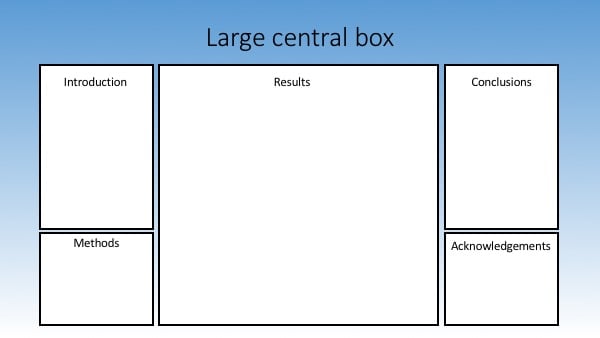
- Large central box. Another commonly used and effective style is one employing a large central box, often used for displaying all of one’s figures, or at least the majority of the visual data. This central box is then flanked by two equally-sized columns, where the introduction, methods, conclusions, and acknowledgements sections are inserted. The advantage of this style is that it will display your data most prominently, making it the star of your presentation.
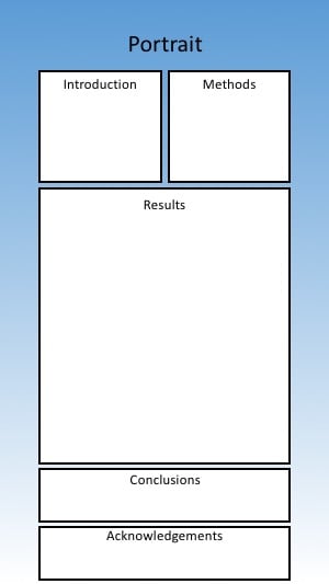 Portrait. This style displays a poster vertically rather than horizontally. Instead of displaying your information as columns, you may choose to display it as rows. It can be more catchy because it is generally less common and will stand out; however, be careful not to hang your poster too low. If it is pinned to low, some of the poster will naturally sit outside of the reader’s field of view because of its length, and will be more difficult to read. The Thompson Rivers University Library provides useful tips on how to craft this type of poster using Powerpoint.
- “Better Poster.” This new take on scientific poster design was conceived by Mike Morrison, a psychology doctoral student at Michigan State University. The idea is that the main research finding is written across the center of the poster in a large font. Hence, spectators can read the text from many feet away and immediately understand the point of the work. The other poster sections like the introduction, methods, and figures flank the central region, and a scannable barcode is included that links readers to more information if they desire it.
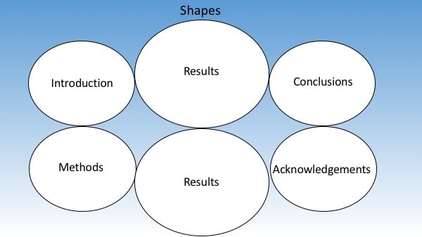
- Shapes. In this type of poster, written and graphical information are inserted into larger circles or ovals, that are arranged in some logical pattern across the poster. This style has the advantage of being different and potentially more catchy, but it can be trickier to make figures fit nicely into circular shapes rather than a square or rectangular boxes.
Background and color
One of the best ways to grab your audience’s attention is with the background and color of your poster. You can choose essentially any background, but two common approaches are either a solid color, or a “themed” background that is relevant to the work you are presenting. The latter is catchy, but beware. A distracting background or clashing colors can take away from what should be the focus of your poster - the data and your story. If you choose a single-color background but want to add a bit more “flash,” you can include a subtle gradient (as is shown in all of our illustrations above) so that the color fades to a lighter or darker version of itself from the top of the poster to the bottom. Depending on the color you select for the background, you’ll want to make sure that the color of your font is compatible. Use high-contrast between these colors so that your text is easily read. Similarly, be cognizant of audience members that are color-blind; avoiding red and green is a good idea for this reason but there are many other ways to make your poster more accessible.
Final thoughts
Though we’ve just presented some standard formatting guidelines for making a scientific poster, you shouldn’t hesitate to be creative. After all, your poster is a representation of your work and a reflection of you, so make it your own!
Additional resources on the Addgene blog
- Check out this blog post on navigating the poster session
- Find tips to make the most of your conference attendance
- Read all of our blog posts about conferences
Topics: Science Careers, Conferences, Early Career Researcher


Leave a Comment