Starting today, you may notice some changes to our website! Part of sharing science and making access to materials easier is improving the tools you use to share and access them. Addgene’s product, development, and content teams have made some changes to the look and feel of addgene.org. Some you’ll notice right away, while others may be less obvious — but every change is meant to make your experience on our website better so you can get the resources you need more easily.
Here’s what to expect:
Search bar
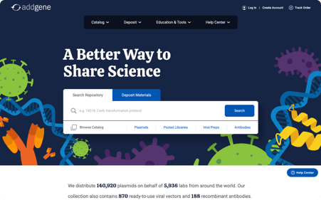
The biggest change is to our most frequently used feature: the search bar. We’ve changed the colors and centered it on the page, so your eyes will land on it as soon as the homepage opens. You’ll notice it now has two options: “Search Repository” and “Deposit Materials”. The “Search Repository” function is our same search bar. And if you’re in the mood to browse our catalog, you can use the links under the search box to go straight to your materials of interest!

Figure 1: The new search bar.
![]() Pro tip! You can use a manuscript title to search for plasmids from a specific paper.
Pro tip! You can use a manuscript title to search for plasmids from a specific paper.
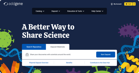
If you’re ready to start a deposit, simply click on “Deposit Materials” and the search bar will change to an easy-to-use depositing guide, with links to our most helpful depositing articles. If you’re depositing data, instead of materials, there’s a “Contribute to the Data Hub” link in the Deposit bar. Note that if you’re not logged in, the “Deposit Materials” bar will prompt you to log in or create an account.

Figure 2: The new deposit materials bar
New menu
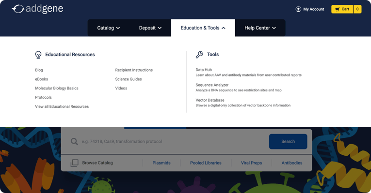
Most common activities can be done straight from the new search bar, but the menu just above it can help you quickly and easily navigate to educational resources, tools, collections in our catalog, and the Addgene Help Center. A big part of this redesign was pulling all of our science options into a single place, so you can quickly navigate around the Addgene website without scrolling up and down the page.

Figure 3: The Education & Tools menu
Further down
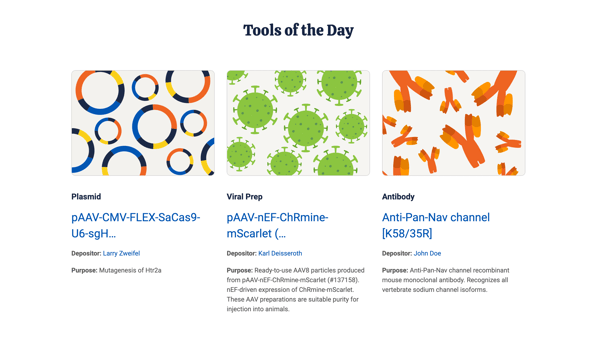
What happens if you do scroll down? You’ll find Blugene, as well as information about Addgene, our mission, links to our deposit, request, and educational resources page, and previews for our three most recent blog posts. Finally, you’ll find everyone’s favorite section: Tools of the Day. Our plasmid and viral vector of the day have a fresh new look and a fresh new friend: Antibody of the Day!
 Figure 4: The plasmid, viral prep, and antibody of the day
While those are the biggest changes, there are plenty of less obvious ones to discover as you browse. You may find one of your most frequently used buttons stands out better on the page, or that the text is just a little bit faster to skim through. Users with disabilities will find Addgene’s website easier to navigate, thanks to design choices informed by Web Content Accessibility Guidelines (WCAG).
But don’t take our word for it — check out all the new features and designs addgene.org! And when you’re finished, feel free to take a moment to let us know what you think, through the yellow popup at the bottom of the page. Happy surfing!
This post was written by Addgenies Jo Dwyer and Rachel Leeson
Topics: Addgene News, Using Addgene's Website


Leave a Comment